

DESIGNED 2025
The “definitive” Home
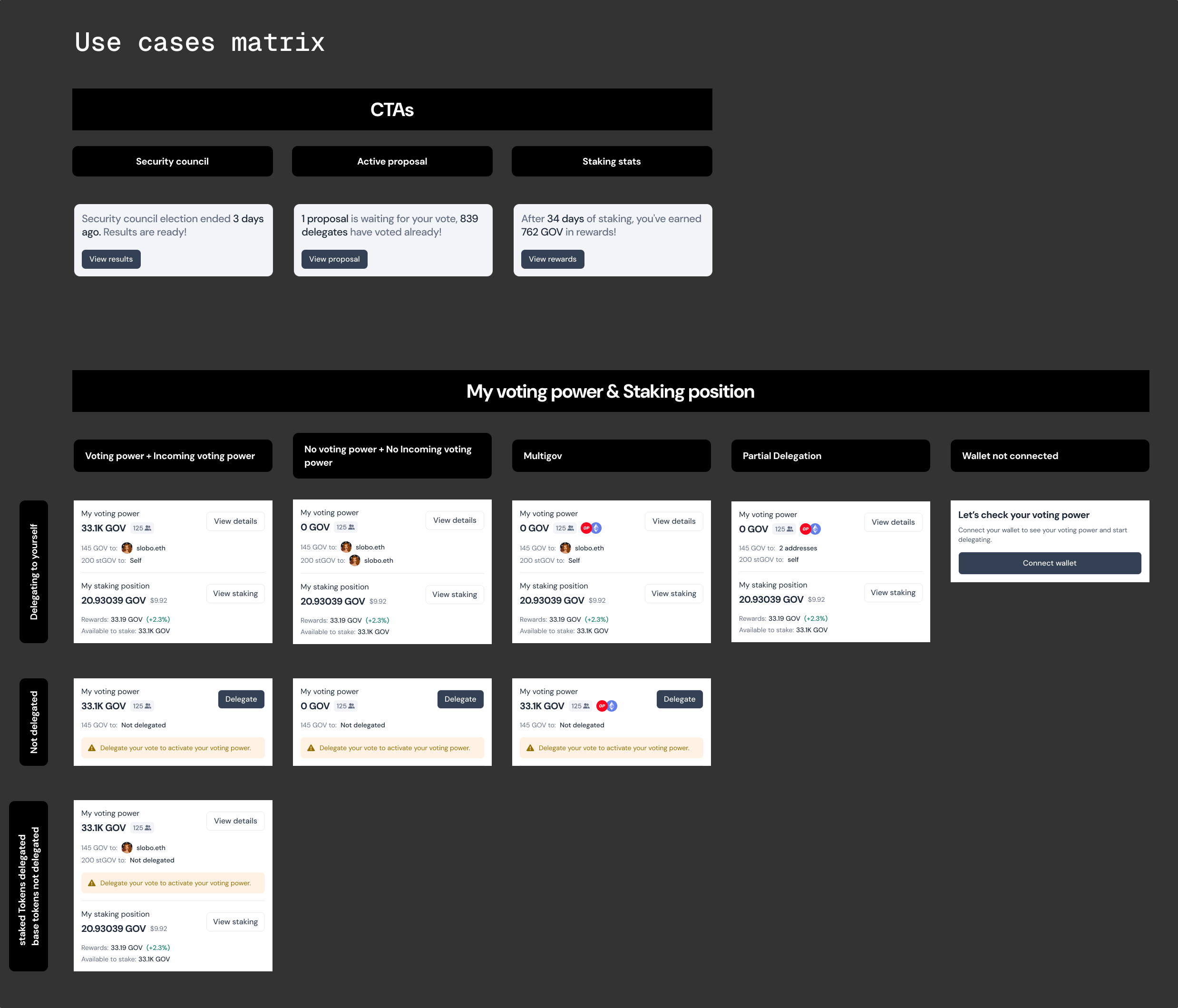
Governance dashboard for Tally
Tally is the tool that lets decentralized organizations run themselves onchain. Proposals, votes, token delegation, staking rewards.
1.Problem
A homepage with no soul
DAOs were asking for a homepage that actually reflected them: their treasury, their activity, their community. What existed said nothing about any of it.
Pains
- ✦Members had no visibility of their own status within the DAO
- ✦Every organization looked identical to the next
- ✦Treasury balance, participation and governance health were buried elsewhere
Goal
Redesign the homepage to become a place that reflects its unique identity, surfaces the data that matters, and gives every member a reason to understand and care about what they're part of.

2.Context
The reality of the behind
Getting deep into the problem revealed the problem was never visual. The homepage was failing because it had nothing meaningful to say.
Analytics showed a telling pattern
Users navigating back and forth between the homepage and deeper sections, searching for an overview that didn't exist. That loop became the brief.
DAO admins confirmed it
They wanted governance health, treasury activity, and community pulse. Visible, immediate, theirs.
The redesign had three jobs
Make each DAO feel distinct, show members where they stood, and surface governance health without making anyone go looking for it.
3.Solutions
Drawing the bones
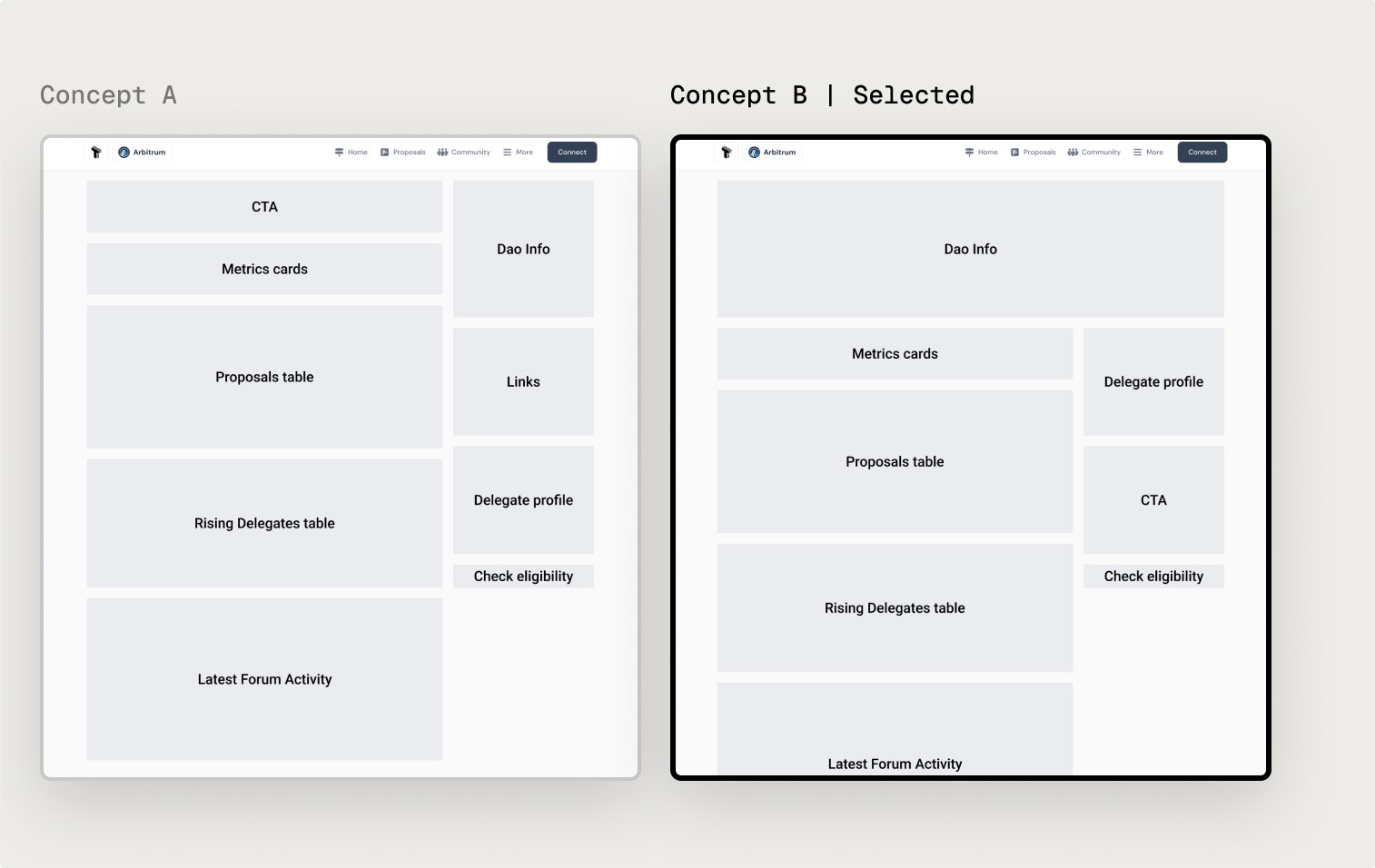
Three weeks. Two directions. One decision that would define how thousands of DAO members experienced their community.
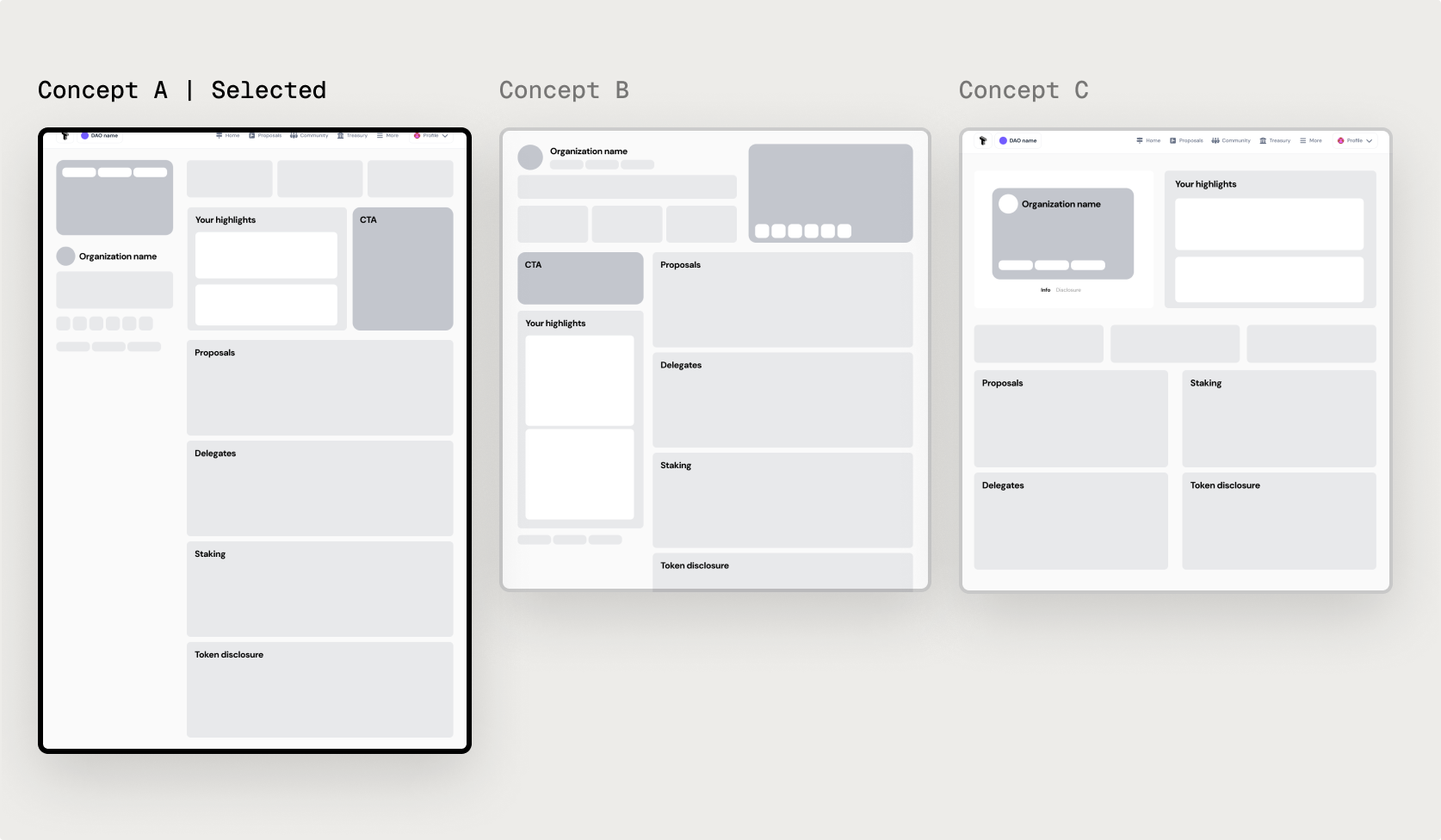
Concept A
Clean hierarchy, every metric in its place. Functional, but it solved the data problem while leaving identity untouched.
Concept B | Selected
Identity first, data second. The DAO's visual personality set the tone — the skin that made drawing community feel natural.
Why Concept B won
The team aligned on one principle: a homepage that makes members feel something will always outperform one that simply informs them. Concept B built that feeling first.
4.First iteration
First big change
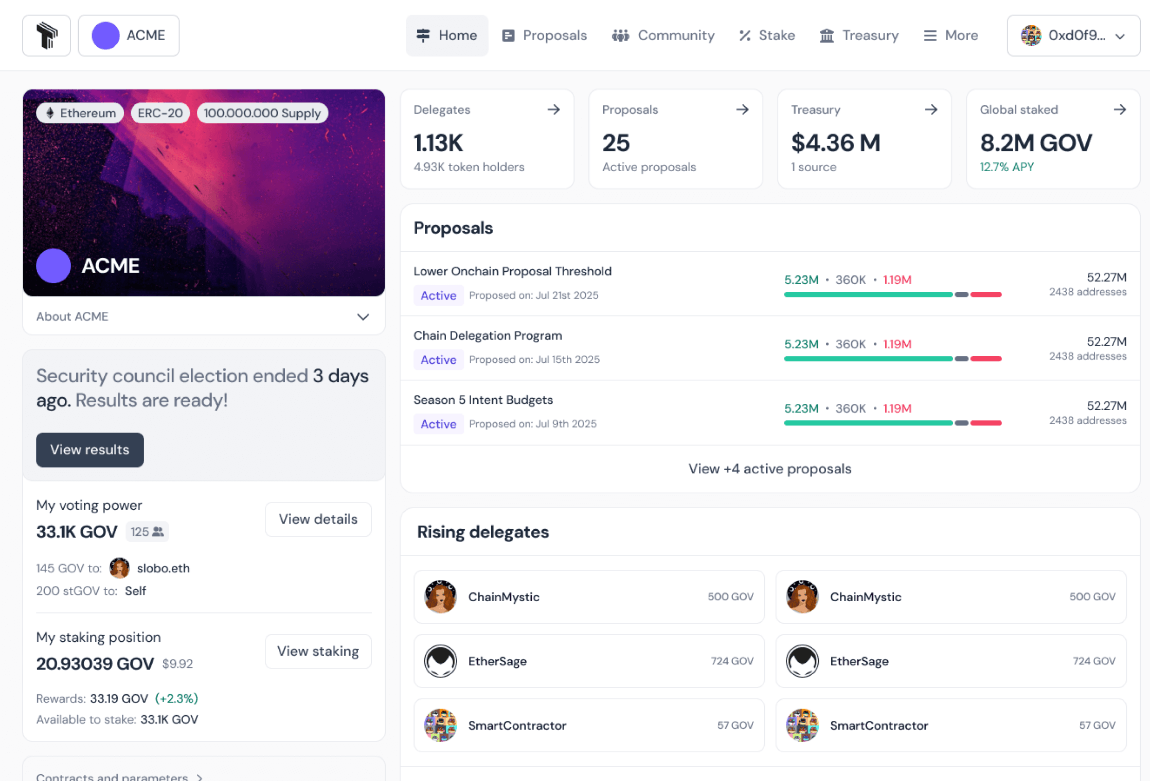
The homepage went live and the signal was immediate. 35% of Tally's largest DAOs updated their banner and profile in the first weeks. For the first time, organizations were treating the homepage as something worth owning.
5.New redesign
Changing times, changing experience
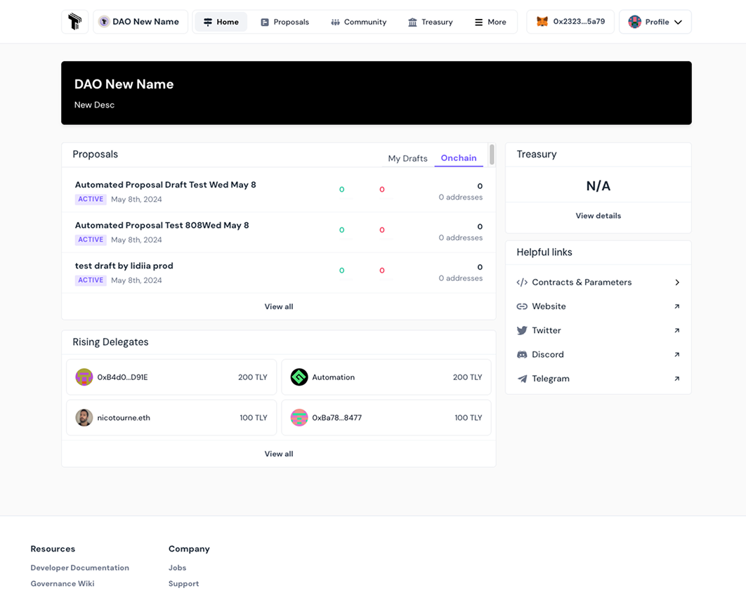
A year later, Tally had grown. The homepage was working, but the product around it had changed significantly, and the design needed to catch up.
New goal
A homepage flexible enough to serve any DAO, without losing the identity-first approach that made version one work.
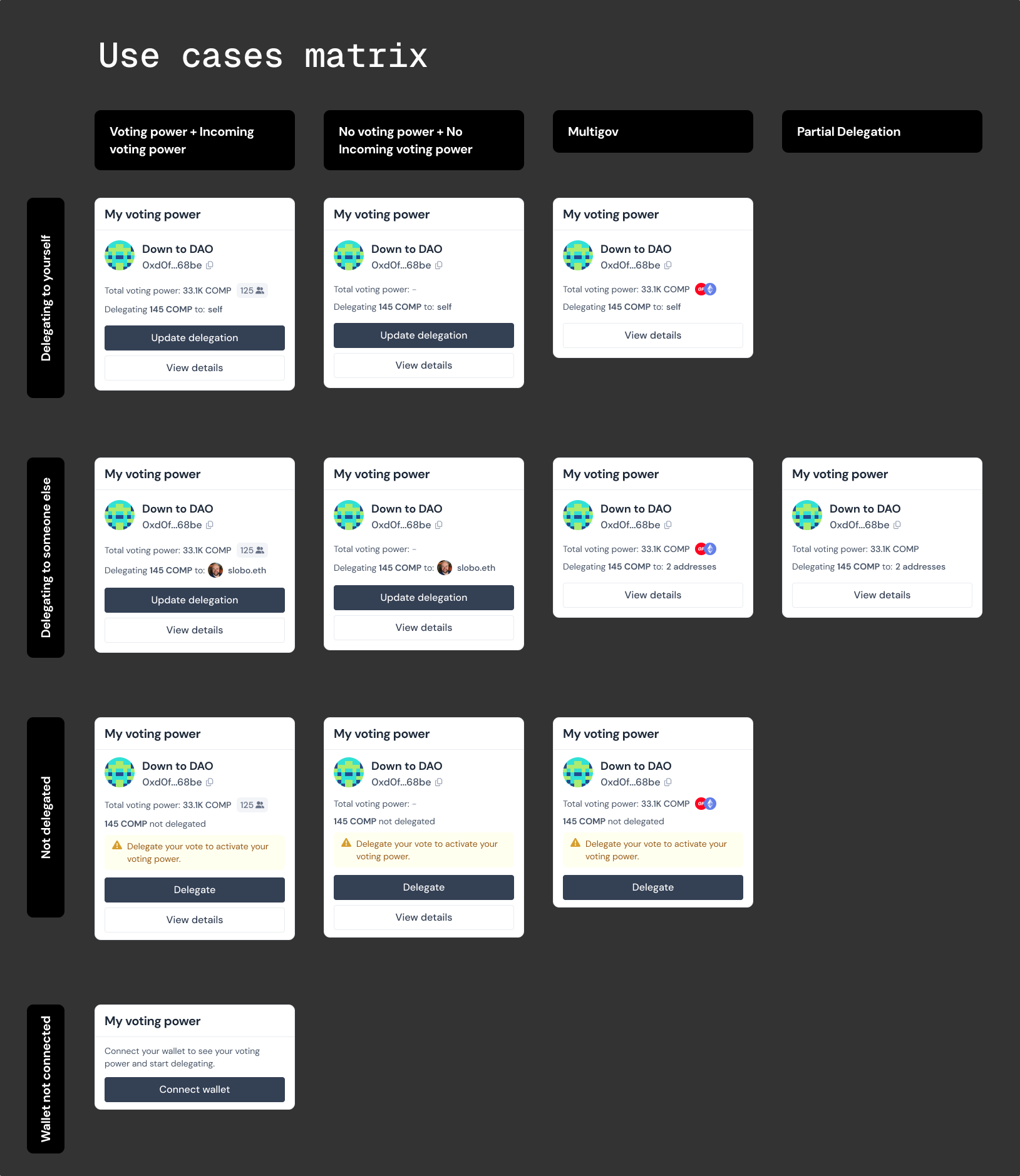
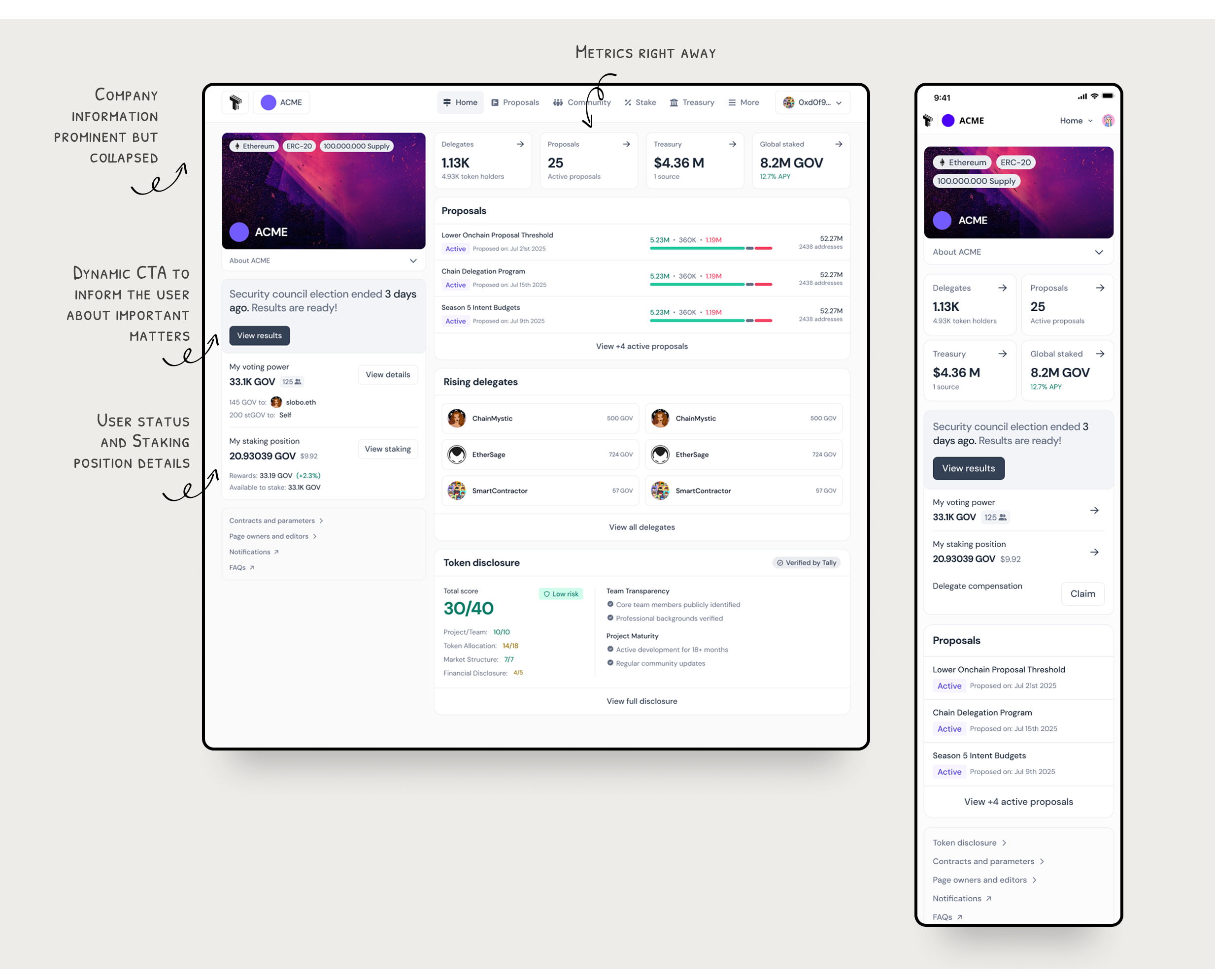
New features
- ✦Staking
- ✦Token distribution
- ✦Pre-governor

6.Result
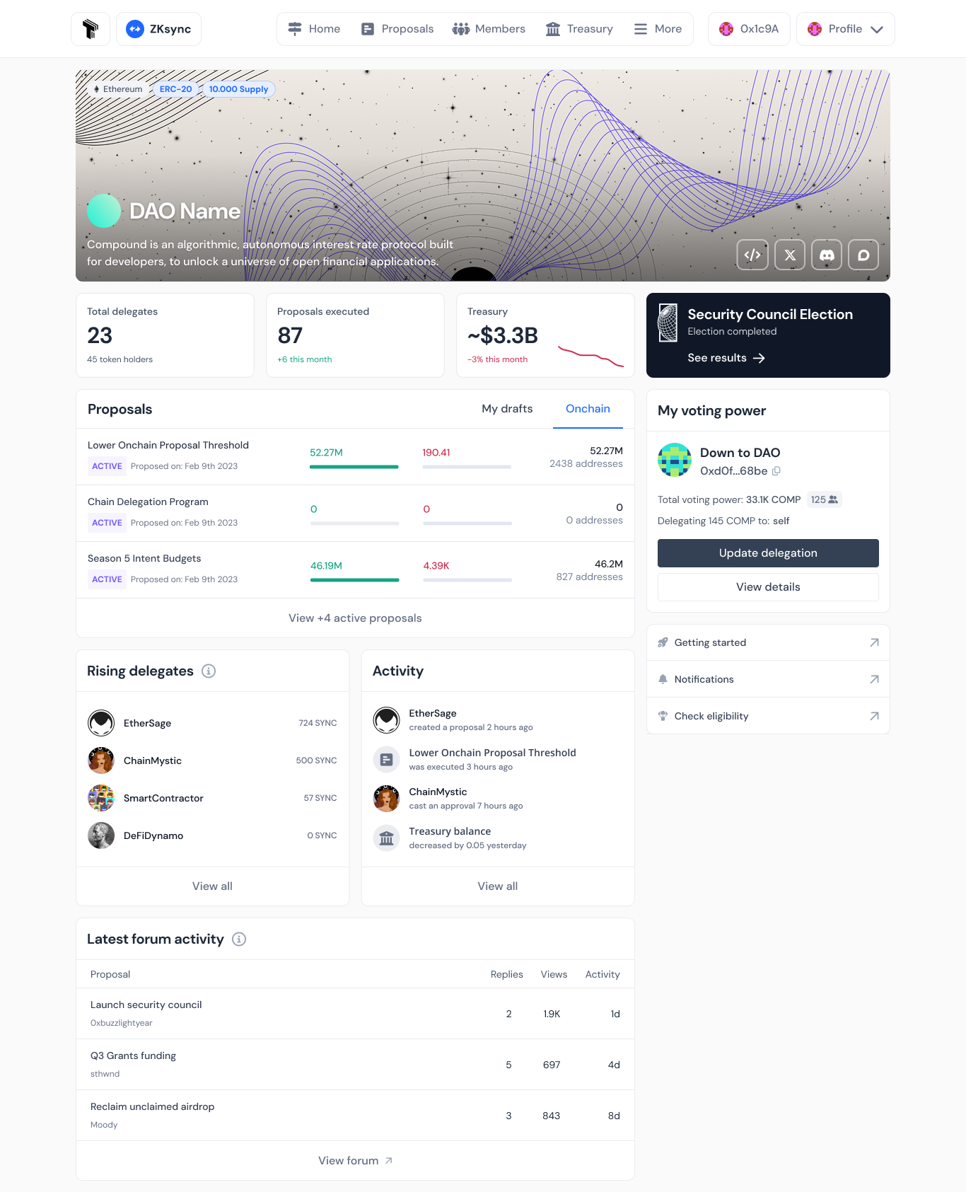
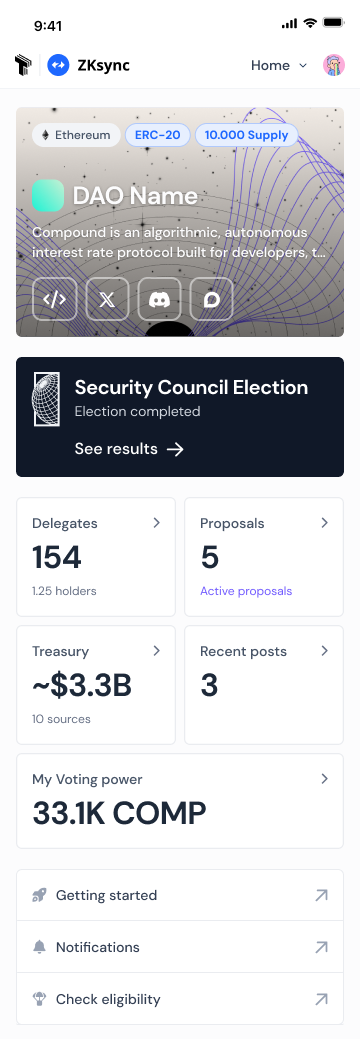
The “definitive” Homepage
Redesigning what's already working is its own kind of courage. Traffic held. New features landed cleanly. The quotes around “definitive” remain. In a product that moves as fast as its ecosystem, no homepage is ever truly final. But this one was built to adapt. And it did.

The best design decisions start with a good brief.
I'm ready for yours.